University of Virginia
Challenge
Website redesign. This project was done during the Aela’s Master of Interface Design bootcamp.
My role
User research, new information architecture and user interface design.
KPIS
 How to measure success?
(Time spent in the library website).
01
Meeting the user
EARLY-STAGE RESEARCH
PERSONA
Simon
COLLEGE STUDENT
Age: 21
Income: Low
Technology Proficiency: High
Favorite Brands: Apple, Google, Spotify.

02
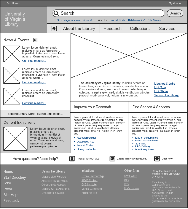
Old Website Analysis
ISSUES
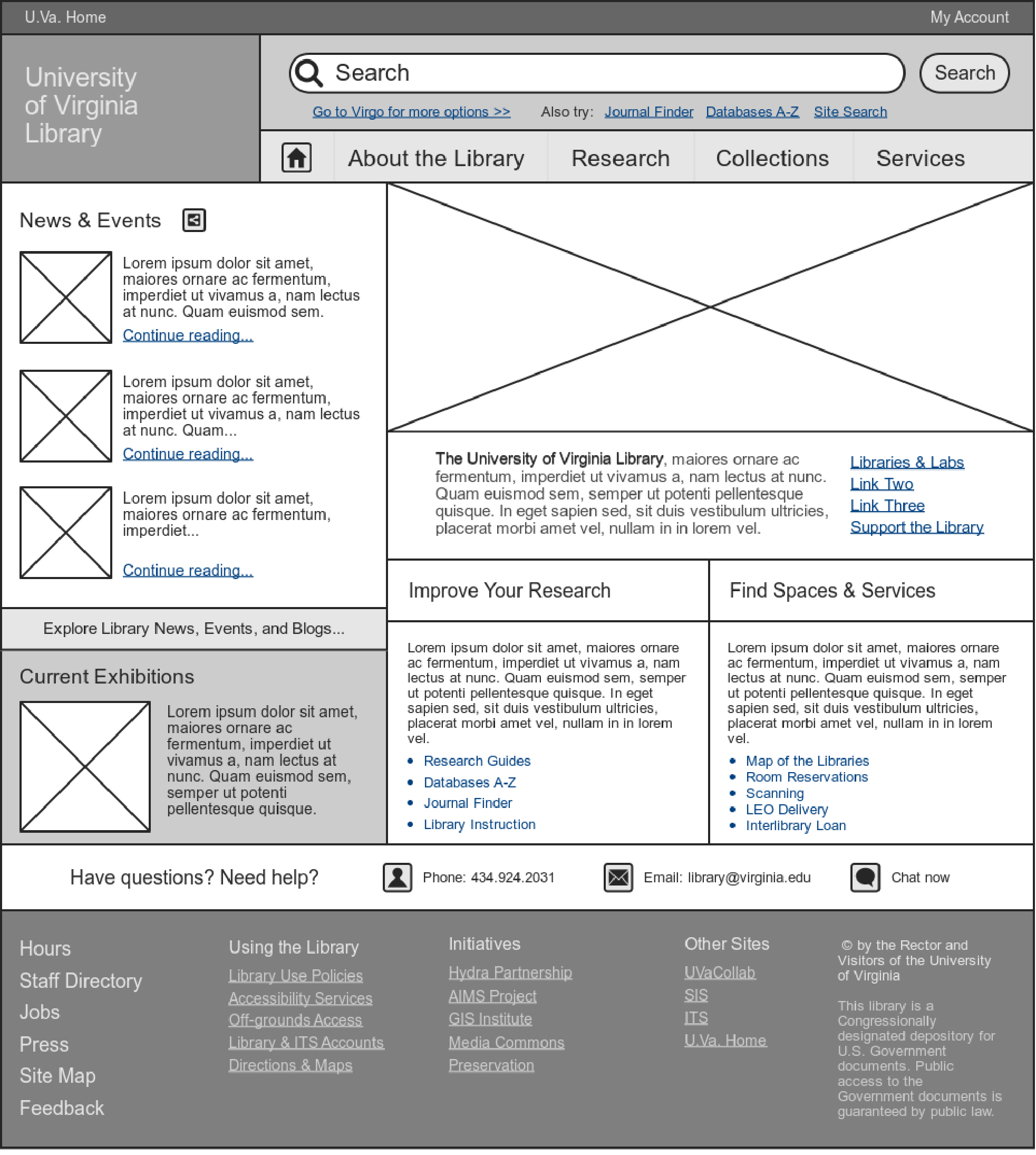
01. Contrast and Hierarchy
It’s not defined. It has a ton of information with same weight and in a tight space.
02. Navigation
The primary menu (About the Library, Research etc.) has items that users don’t think are useful.
03. Missing Information
Some useful information, like operating hours, phone, email and chat, are missing or hard to find.
03
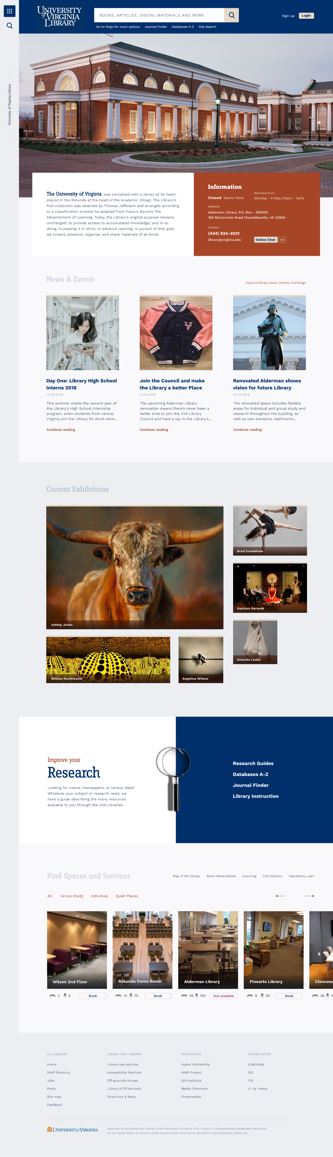
User Interface
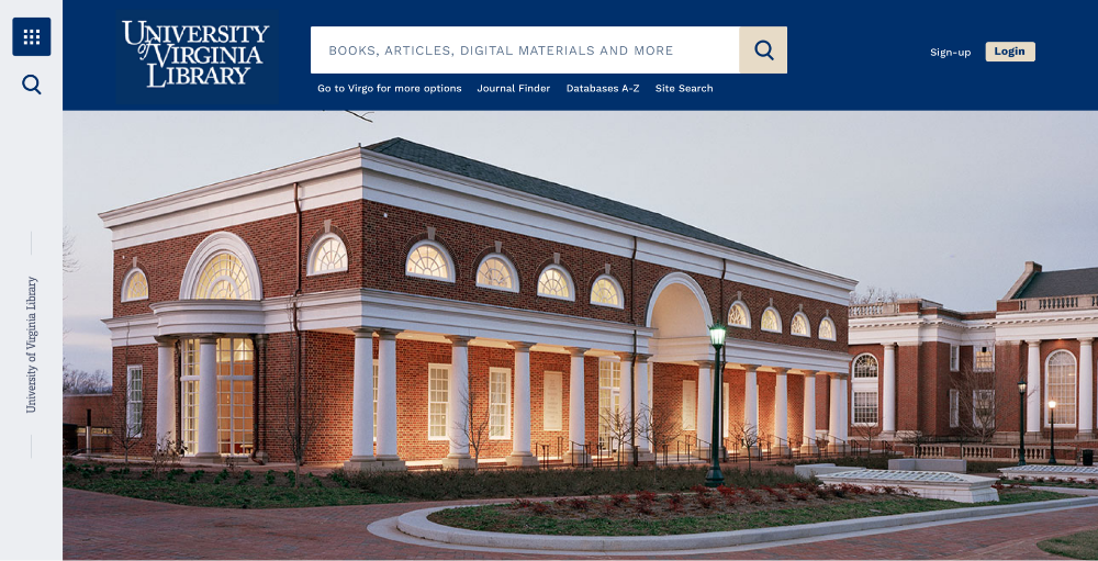
HOME
EXPANDED MENU
EXPANDED SEARCH
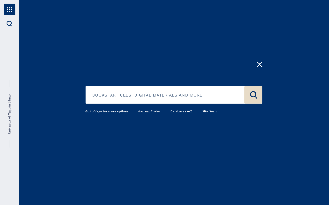
IMPROVEMENT
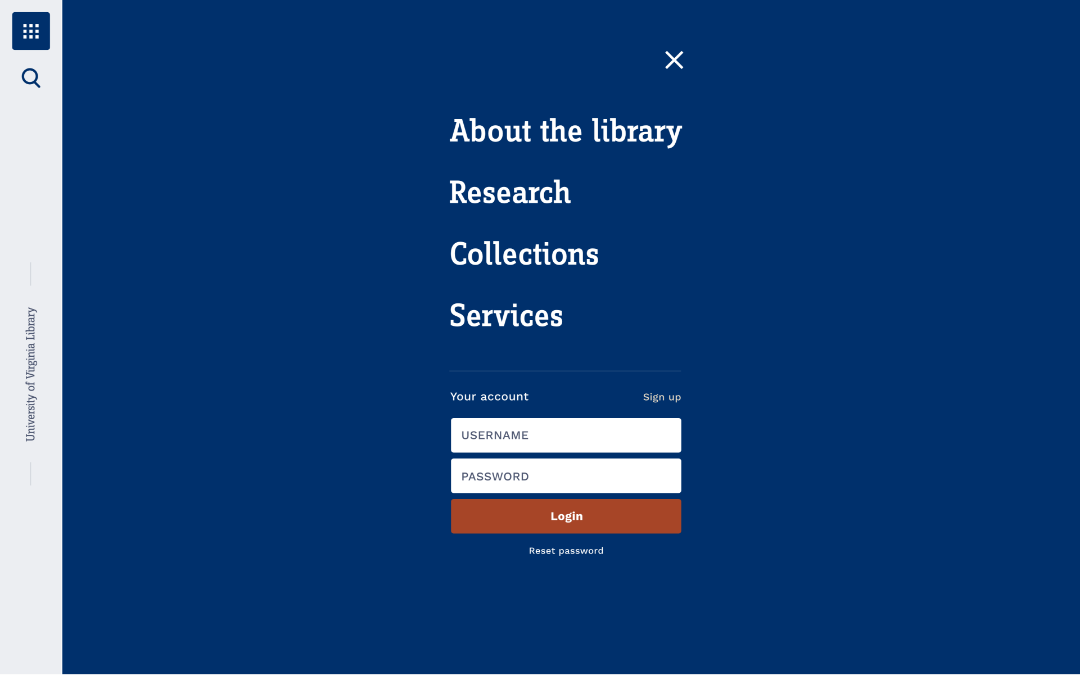
01. Navigation
Navigation was structured by the search as a primary navigation, where users are encouraged to access all the library content (books, academic works, articles, etc.) and a hamburger menu as a secondary navigation, with access to all other library services. They’re both fixed in the website, so the user can reach them anytime and anywhere.
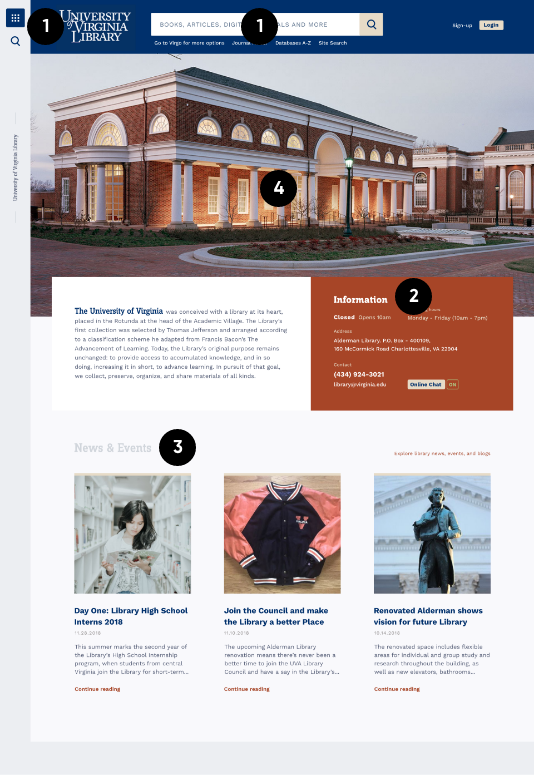
02. Information Box
Operating hours, phone and address are the most required information for new students or those who don’t visit the library so much. It’s one of the main reasons to access the website. Everyday students, at least, want to know if the library is open or not. That’s why it’s a primary information in the website cover.
03. News
The next content is News & Events. Even if many students are not quite interested in this information, it says that the website is being updated frequently.
04. Colors and UI Delight
Instead of explaining the use of the brand colors, contrasts and hierarchy, I’d love to say that adding some colors inspired by the beautiful exterior of the library in the color palette was a delightful part of the UI. By the way, it was something that came in my mind from the beggining of the project, to try to transpose the library building in the UI.
STYLE GUIDE