JamiQ Dashboard
Challenge
To create a user interface based in a wireframe. This project was done during the Aela’s Master of Interface Design bootcamp.
My role
User interface design.
01
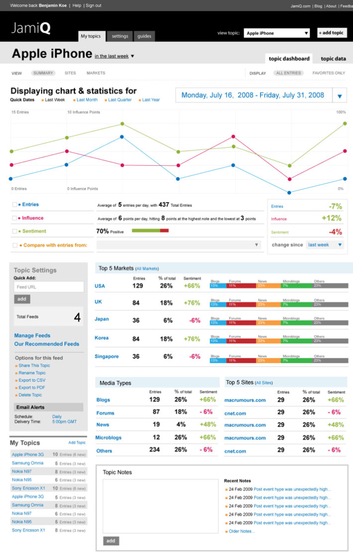
Wireframe
02
User Interface
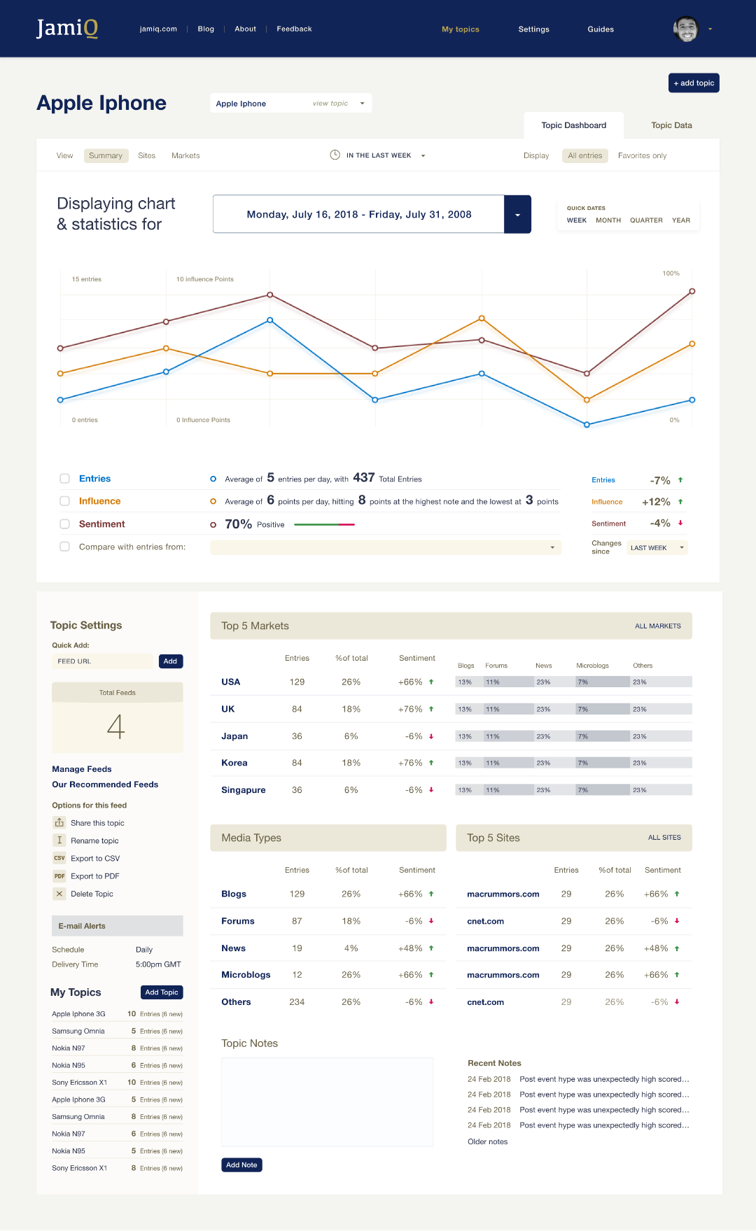
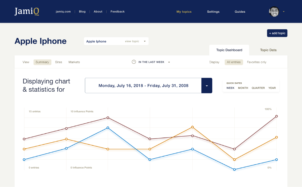
UI IMPROVEMENTS
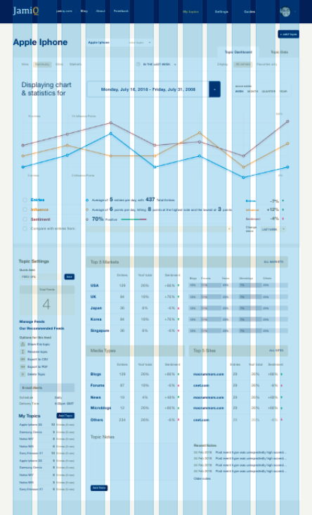
01. Grid
Using a 12 column grid and separating sessions in blocks, helped organize content and made the changes easier in responsive design.
02. Colors
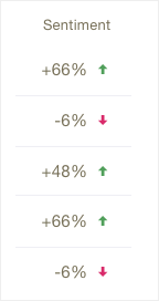
Greens and reds that indicate positive and negative were changed by arrows and data became easier to read. Loud and quiet colors were balanced to guide the user eyes and to provide hierarchy.
03. Chart
The chosen chart works well with a few items and variables, and JamiQ has only 3 items (Entries, Influence and Sentiment), two variables (time and visitors), and just 7 data points.
04. Visual Relief
A clean layout with high margins made the interface softer.
STYLE GUIDE