Rick Riordan

Challenge
To introduce his books to a new generation of readers.
My role
Kickoff meetings, stakeholder interviews and user interface design.
KPIS
 How to measure success?
01
Meeting the user
PERSONA
Valentina
STUDENT
Age: 10
Income: -
Technology Proficiency: Medium
Favorite Brands: Paul Frank.

EARLY-STAGE RESEARCH
Websites
are boring.
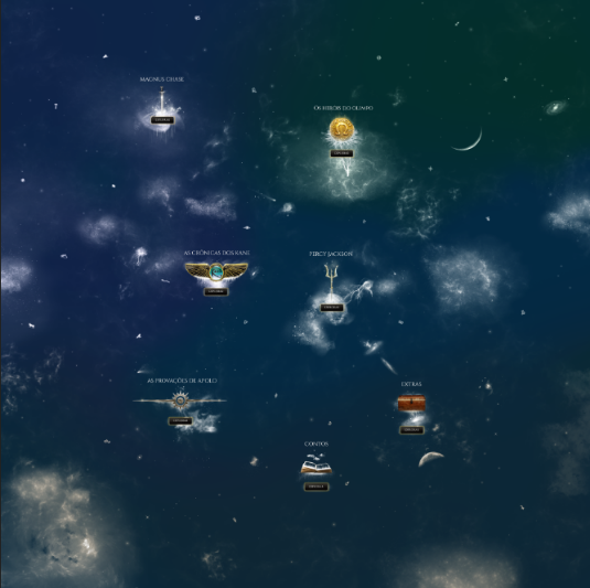
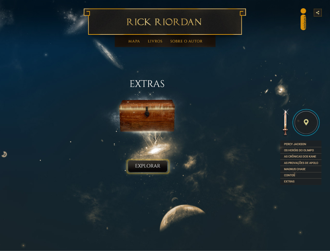
Nobody can deny that pre-teens love playing games. In the digital world they expect to interact with fantasy, different worlds, with high level graphics. They want the experience to be a hero, a creature and to explore new worlds.
Considering these users needs and the goal of selling books, the solution could be something like a game, but without leaving the main product behind, the books. Therefore, the interaction proposal was a map navigation, with common visual elements, like hero position, items that your hero is carrying and navigation around the screen, but nothing too complex, considering, they can’t forget about the books.
Mythology
The main theme of Rick Riordan books is mythology and creating the map as a universe sky is a great project start. The constellations are related to myths and gods in different cultures. The Gemini constellation, for example, was created by Zeus (Greek culture), the Egyptians say the pyramids were lined up with the Orion constellation. There are many more examples of the relationship between mythology and astronomy.
02
User Interface
HOME
SERIES PAGE
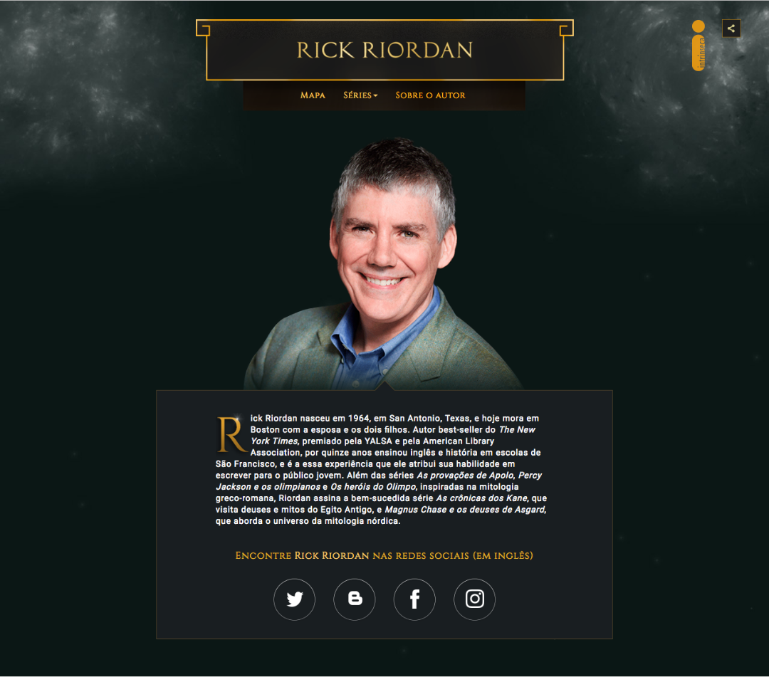
AUTHOR
IA AND STRATEGY
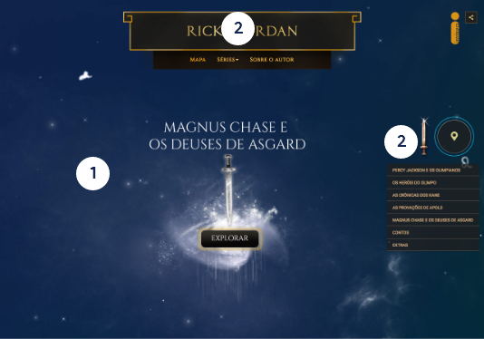
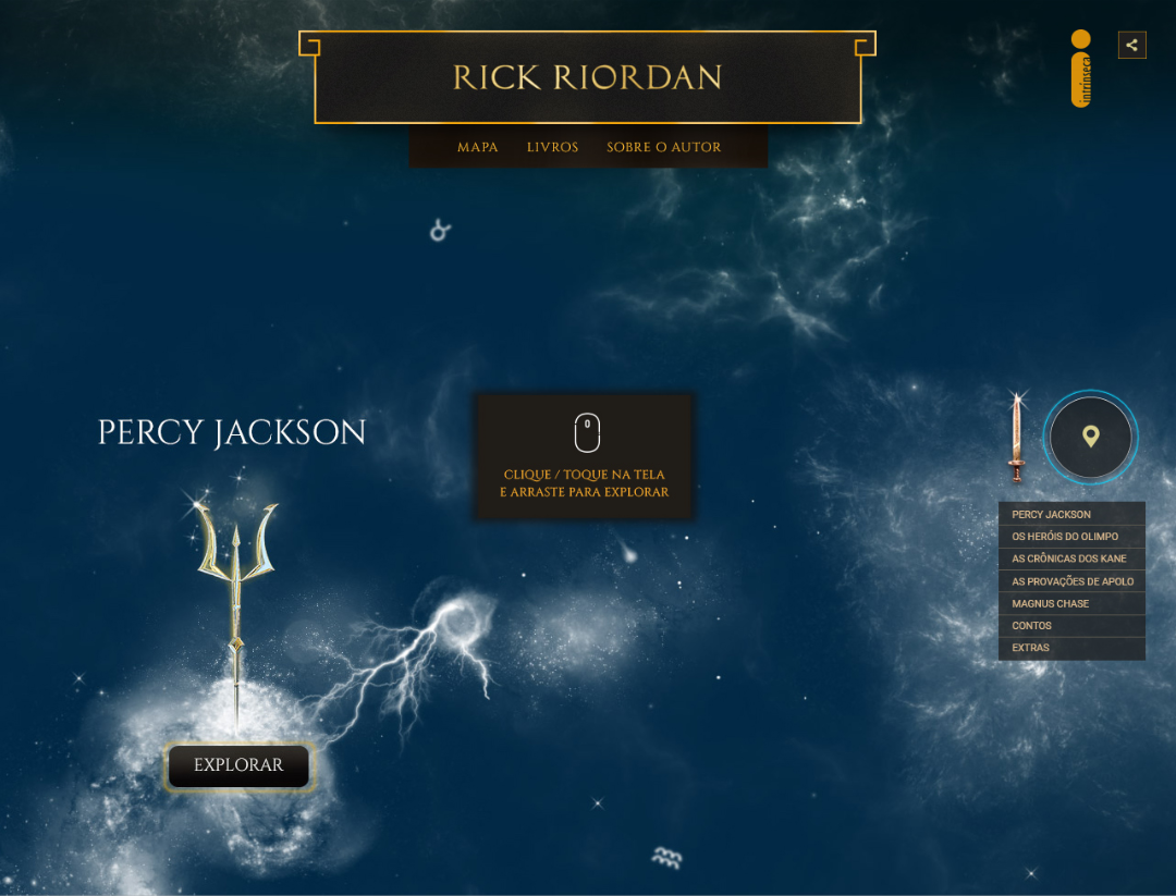
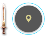
01. Click and drag navigation
To explore the map users have to click or touch and drag.
02. Navigation Options
Two navigation options were applied to keep usability simple. The first (header – global navigation), goes directly to the content, and the second one (bellow Magnus Chase sword) goes to the special points in the map.
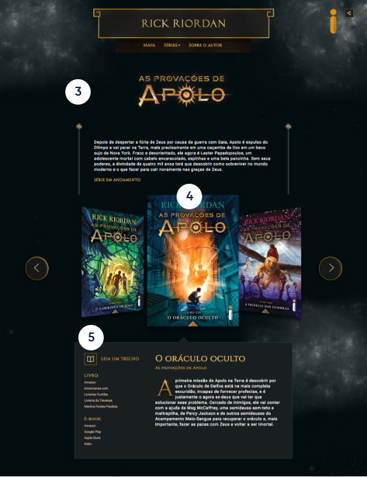
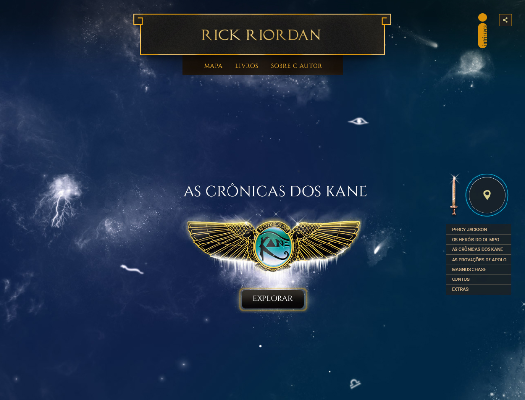
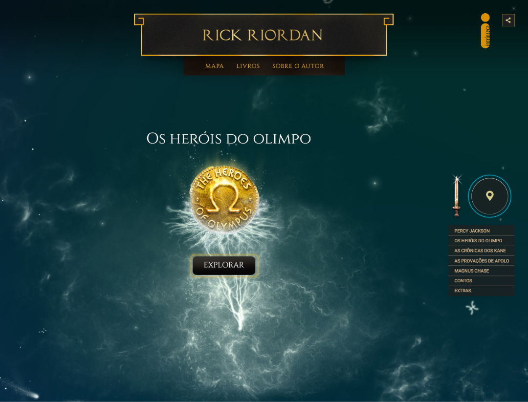
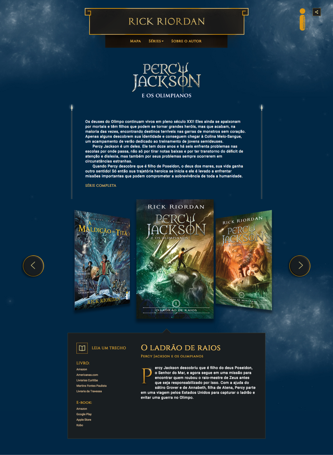
03. Series page UI
Each series page has customized elements: brand, lighting and background color.
04. Product highlight - Book covers
Book covers are the biggest elements of the page and are placed in a 3D navigation. This special treatment was done to highlight the most important part of the project: the books.
05. Book content
For each book, users can read the first chapter and access all the e-stores that sell print or digital versions of the book, since increasing the sales is one of the most important goals of the website.
STYLE GUIDE


03
Final Words
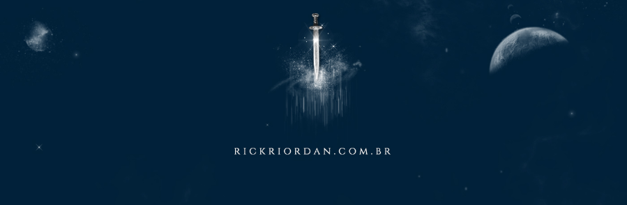
Check the website at www.rickriordan.com.br
It was a pleasure to work for a well-known author and the huge challenge of meeting his fans expectations for the new website. It was so much fun and I learned a lot. I remember when the developer and I were working on the navigation map and I decided to work with animated gifs. When he applied my animated gifs on the map, it was a disaster, because gifs don’t work well with transparency. Then, with a very tight deadline we had to learn how to work with sprites and in the end everything worked out.